How to hide/show toolbar in response to scrolling on Android
Last updated on April 23, 2015 by Obaro Ogbo/em>
The Toolbar is a new android widget, introduced in API 21 (Lollipop), designed and intended to replace the ActionBar. The ActionBar was introduced in API 11 (Honeycomb), to appear at the top of an activity's window. The Toolbar, on the other hand is more powerful than the ActionBar. For example, the Toolbar can be placed at any arbitrary point in the activity layout hierarchy. There can even be multiple Toolbars in a single Activity.
This tutorial will discuss implementing the ability to hide and/or show a Toolbar in response to scrolling action on a RecyclerView. RecyclerView is also a new widget, introduced in API 21, to replace ListView. A previous tutorial described implementing RecyclerView.
Toolbar is available for pre Lollipop devices through the AppCompat libraries, and so, the techniques discussed in this tutorial will be available to all Android devices with API 4 and above.
Implementation
As stated, the Toolbar widget is available via the AppCompat libraries, so be sure to include the required libraries. We are using a RecyclerView with CardView for our scrollable list implementation, so be sure to check out this tutorial for a refresher on how it works. To include the required libraries, add the following lines to your app build.gradle file.
dependencies {
    compile 'com.android.support:appcompat-v7:21.0.3'
    compile 'com.android.support:recyclerview-v7:21.0.3'
    compile 'com.android.support:cardview-v7:21.0.3'
}
On the other hand,
- Right click on Project name
- Select Open Module Settings
- Select Dependencies
- Ensure that appcompat-v7, recyclerview-v7 and cardview-v7 are added.
Since we are going to use a Toolbar as our ActionBar, we define our style to use a NoActionBar theme.
    <style name="AppTheme" parent="Theme.AppCompat.Light.NoActionBar">
        <item name="colorPrimary">@color/colorPrimary</item>
        <item name="colorPrimaryDark">@color/colorPrimaryDark</item>
        <item name="colorAccent">@color/colorAccent</item>
    </style>
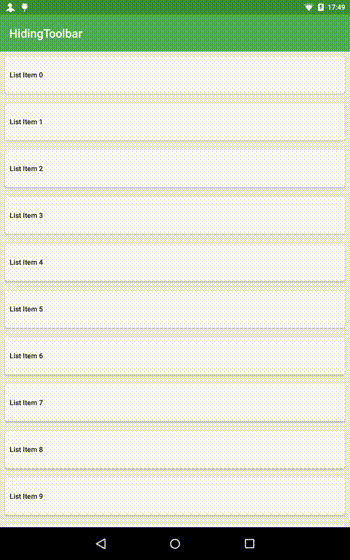
The next step is to create/design the MainActivity layout. This is saved as activity_main.xml. We implement a very simple layout, with just the RecycleView and Toolbar making up the entire layout. We are using a FrameLayout, so the Toolbar overlays the RecyclerView. We add a padding, equal to the height of the Toolbar, to the top of the RecyclerView. This ensures that the Toolbar doesn't overlay (or block) any of the list items.
<FrameLayout xmlns:android="http://schemas.android.com/apk/res/android"
    android:layout_width="match_parent"
    android:layout_height="match_parent">

    <android.support.v7.widget.RecyclerView
        android:id="@+id/recyclerView"
        android:layout_width="match_parent"
        android:layout_height="match_parent"
        android:paddingTop="?attr/actionBarSize"
        android:clipToPadding="false"/>

    <android.support.v7.widget.Toolbar
        android:id="@+id/toolbar"
        android:layout_width="match_parent"
        android:layout_height="?attr/actionBarSize"
        android:background="?attr/colorPrimary"/>

</FrameLayout>
We create a simple CardView for use with our RecyclerView. The CardView has a single TextView to show the list item number. The Adapter used is also a simple RecyclerAdapter.
<android.support.v7.widget.CardView xmlns:android="http://schemas.android.com/apk/res/android"
xmlns:card_view="http://schemas.android.com/apk/res-auto"
android:layout_width="match_parent"
android:layout_height="wrap_content"
android:layout_gravity="center"
android:layout_margin="8dp"
card_view:cardCornerRadius="4dp">
<TextView
android:id="@+id/itemTextView"
android:layout_width="match_parent"
android:layout_height="?attr/listPreferredItemHeight"
android:gravity="center_vertical"
android:padding="8dp"
style="@style/Base.TextAppearance.AppCompat.Body2"/>
</android.support.v7.widget.CardView>
Excellent. Now we implement the MainActivity class. We simply inflate the RecyclerView and populate with Strings.
public class MainActivity extends ActionBarActivity {
    private Toolbar toolbar;

    @Override
    protected void onCreate(Bundle savedInstanceState) {
        super.onCreate(savedInstanceState);
        setContentView(R.layout.activity_main);

        toolbar = (Toolbar) findViewById(R.id.toolbar);
        setSupportActionBar(toolbar);
        setTitle(getString(R.string.app_name));
        toolbar.setTitleTextColor(getResources().getColor(android.R.color.white));

        RecyclerView recyclerView = (RecyclerView) findViewById(R.id.recyclerView);
        recyclerView.setLayoutManager(new LinearLayoutManager(this));
        RecyclerAdapter recyclerAdapter = new RecyclerAdapter(createItemList());
        recyclerView.setAdapter(recyclerAdapter);
    }

    private List<String> createItemList() {
        ArrayList<String> list = new ArrayList();
        for(int i = 0; i < 20; i++) {
            list.add(new String("List Item " + i));
        }
        return list;
    }

}
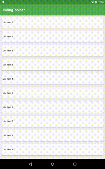
At this point, scrolling the list has no effect on the Toolbar. What we will do, is to implement a ScrollListener, so that whenever the RecyclerView is scrolled, we determine if it is appropriate to also scroll the Toolbar out of (or into) view. We get the current Toolbar height, which could be different depending on device type (tablet or phone), and then override the onScrolled() method. In this method, we monitor the current toolbar position using the toolbarOffset variable, and decide to scroll the toolbar or not by calling the onMoved() method. onMoved() is an abstract method that must be overriden when MyScrollListener is implemented.
public abstract class MyScrollListener extends RecyclerView.OnScrollListener {

    private int toolbarOffset = 0;
    private int toolbarHeight;

    public MyScrollListener(Context context) {
        int[] actionBarAttr = new int[] { android.R.attr.actionBarSize };
        TypedArray a = context.obtainStyledAttributes(actionBarAttr);
        toolbarHeight = (int) a.getDimension(0, 0) + 10;
        a.recycle();
    }

    @Override
    public void onScrolled(RecyclerView recyclerView, int dx, int dy) {
        super.onScrolled(recyclerView, dx, dy);

        clipToolbarOffset();
        onMoved(toolbarOffset);

        if((toolbarOffset < toolbarHeight && dy>0) || (toolbarOffset > 0 && dy<0)) {
            toolbarOffset += dy;
        }
    }

    private void clipToolbarOffset() {
        if(toolbarOffset > toolbarHeight) {
            toolbarOffset = toolbarHeight;
        } else if(toolbarOffset < 0) {
            toolbarOffset = 0;
        }
    }

    public abstract void onMoved(int distance);
}
Now, we have to tell the RecyclerView to use a MyScrollListener implementation, and it must implement onMoved(). Add the following code to MainActivity (after inflating RecyclerView).
        recyclerView.setOnScrollListener(new MyScrollListener(this) {
            @Override
            public void onMoved(int distance) {
                toolbar.setTranslationY(-distance);
            }
        });
Note that we move the toolbar with -distance. This is because on the device screen, the origin is at the top left of the screen (positive is downwards, while negative is upwards). In MyScrollListener, on the other hand, dragging the screen downwards (scrolling up) results in a negative scroll difference, while dragging the screen upwards (scrolling down) results in a positive scroll difference. That's why we are moving the toolbar in the opposite direction (Getting headache yet? No? Me neither).
Conclusion
Hiding the Toolbar is actually a good Material Design implementation, allowing more space for vertical content. There are different show/hide behaviours such as the full snap, where, with any scroll movement, the Toolbar either completely scrolls into (or out of) view (as seen in the Google plus app), and the partial snap, where you have to scroll to a threshold for the toolbar to either completely scroll in or out of view. When you do not reach this threshold, the Toolbar will either return to being completely visible or completely hidden (as seen in the Google Play store app). An excellent tutorial on how to add these behaviours to the above implementation is available here.
The complete source code used in this tutorial is available on github.
Support Xmodulo
This website is made possible by minimal ads and your gracious donation via PayPal or credit card
Please note that this article is published by Xmodulo.com under a Creative Commons Attribution-ShareAlike 3.0 Unported License. If you would like to use the whole or any part of this article, you need to cite this web page at Xmodulo.com as the original source.

Xmodulo © 2021 ‒ About ‒ Write for Us ‒ Feed ‒ Powered by DigitalOcean