How to implement the FAB (Floating Action Button) in Android apps
Last updated on April 23, 2015 by Obaro Ogbo
Material design introduced some new styles, components and widgets. One of such components is the Floating Action Button (aka FAB). The FAB is a special type of circular button that "floats" in the bottom right of the screen, and displays an ink reaction upon press. It should be used to perform the expected primary action in an activity. This action is called the promoted action. The promoted action, according to material design specifications, should be a positive action (like create, add new, etc) rather than a destructive action (like delete).
While the FAB is recommended in the material design specifications, there isn't a default FAB implementation. Application developers must either design and develop their own implementation, or import a third party FAB library. This tutorial would discuss how to create a FAB for both pre-Lollipop and Lollipop devices.

FAB on Pre-Lollipop Devices
The first thing we do is create a custom drawable to represent the FAB.
<selector xmlns:android="http://schemas.android.com/apk/res/android">
    <item android:state_pressed="true">
        <layer-list>
            <!-- Button Shadow -->
            <item android:top="2dp" android:right="1dp">
                <layer-list>
                    <item>
                        <shape android:shape="oval">
                            <solid android:color="#80000000"/>
                            <padding
                                android:bottom="3px"
                                android:left="3px"
                                android:right="2px"
                                android:top="2px"
                                />
                        </shape>
                    </item>
                    <item>
                        <shape android:shape="oval">
                            <solid android:color="#A6000000"/>
                            <padding
                                android:bottom="2px"
                                android:left="2px"
                                android:right="1px"
                                android:top="1px"
                                />
                        </shape>
                    </item>
                </layer-list>
            </item>

            <!-- Pressed Button color -->
            <item>
                <shape android:shape="oval">
                    <solid android:color="@color/colorAccentHighlight"/>
                </shape>
            </item>
        </layer-list>
    </item>

    <item android:state_enabled="true">

        <layer-list>
            <!-- Button shadow -->
            <item android:top="2dp" android:right="1dp">
                <layer-list>
                    <item>
                        <shape android:shape="oval">
                            <solid android:color="#80000000"/>
                            <padding
                                android:bottom="2px"
                                android:left="2px"
                                android:right="2px"
                                android:top="2px"
                                />
                        </shape>
                    </item>
                </layer-list>
            </item>

            <!-- Default Button color -->
            <item>
                <shape android:shape="oval">
                    <solid android:color="@color/colorAccent"/>
                </shape>
            </item>
        </layer-list>

    </item>

</selector>
A selector, like in the code above, is an xml description of a StateListDrawable. This is a drawable that uses a different image to represent the different states of an object. The list of images is traversed from top to bottom, and if a state that matches the current state of the object is encountered, it is used. Because of this, we put the pressed state before the enabled state. If we put the enabled state before the pressed state, then the pressed state will never be shown (since a pressed button is also enabled).
In each state, we define a layer-list, which is the representation of a LayerDrawable. A LayerDrawable draws each element in the array of drawables such that the last element is drawn on top. We use this to simulate a shadow behind the button, and draw an oval shape, with the desired color of the button as the last element in the layer-list.
We only implemented two states: pressed and enabled. If your button can be disabled, you would probably want to implement that also. More information on selectors can be found here.
In the activity_main.xml file (layout for our MainActivity), we implement our FAB as an ImageButton. The background of the button is set to fab_shape.xml defined above, and we also set the image for the button, using android:src. We set the size of our FAB to the material recommended size (56dp), and position it 16dp from both the bottom and right edges.
<RelativeLayout xmlns:android="http://schemas.android.com/apk/res/android"
    xmlns:tools="http://schemas.android.com/tools"
    android:layout_width="match_parent"
    android:layout_height="match_parent"
    tools:context=".MainActivity"
    android:background="@android:color/white">

    <android.support.v7.widget.RecyclerView
        android:id="@+id/recyclerView"
        android:layout_width="match_parent"
        android:layout_height="match_parent"
        android:clipToPadding="false"/>

    <ImageButton
        android:id="@+id/fab_image_button"
        android:layout_width="@dimen/fab_button_diameter"
        android:layout_height="@dimen/fab_button_diameter"
        android:layout_alignParentRight="true"
        android:layout_alignParentEnd="true"
        android:layout_alignParentBottom="true"
        android:layout_marginBottom="@dimen/fab_button_margin_bottom"
        android:layout_marginRight="@dimen/fab_button_margin_right"
        android:background="@drawable/fab_shape"
        android:src="@drawable/fab_ic_add"
        android:tint="@android:color/white"/>

</RelativeLayout>
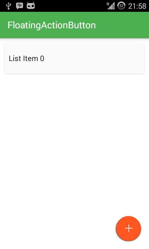
Our MainActivity class is pretty straightforward. We implement a list using RecyclerView, and add a new item whenever the FAB is tapped. An excellent tutorial on using RecyclerView is available here, if you need a refresher.
public class MainActivity extends ActionBarActivity {

    @Override
    protected void onCreate(Bundle savedInstanceState) {
        super.onCreate(savedInstanceState);
        setContentView(R.layout.activity_main);

        final ArrayList<String> list = new ArrayList<>();
        list.add("List Item 0");

        RecyclerView recyclerView = (RecyclerView) findViewById(R.id.recyclerView);
        recyclerView.setLayoutManager(new LinearLayoutManager(this));
        final RecyclerAdapter recyclerAdapter = new RecyclerAdapter(list);
        recyclerView.setAdapter(recyclerAdapter);

        ImageButton fabButton = (ImageButton) findViewById(R.id.fab_image_button);
        fabButton.setOnClickListener(new View.OnClickListener() {
            @Override
            public void onClick(View v) {
                recyclerAdapter.addItem("List Item " + recyclerAdapter.getItemCount());
                recyclerAdapter.notifyDataSetChanged();
            }
        });
    }
}

Congrats. At this point, you have successfully implemented a Floating Action Button that would work across Android devices up to and including Lollipop.
FAB on Lollipop and Greater
While the above code will work on Lollipop devices, we are really simulating the shadows under the FAB, to give the illusion of depth. With Lollipop APIs, we do not need to simulate the shadows. Rather, we set the elevation of the widget and the platform handles shadows. Also, we should take advantage of the feedback provided by the ripple effect, which triggers from the point of contact on a Button.
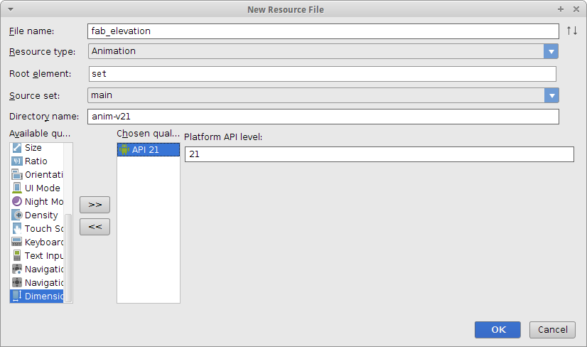
We want the Button to increase its elevation when pressed. To achieve this, we create a file called fab_elevation.xml. Since this file must be available to version 21 devices and greater only, be sure to select "Version" from available qualifiers, and enter 21.
In fab_elevation, we are creating a StateListAnimator (similar to the StateListDrawable). We specify animations that should accompany the different states of the Button. In this case, we increase or decrease the elevation.
<selector xmlns:android="http://schemas.android.com/apk/res/android">
    <item android:state_pressed="true">
        <objectAnimator
            android:propertyName="translationZ"
            android:duration="@android:integer/config_shortAnimTime"
            android:valueFrom="@dimen/elevation_low"
            android:valueTo="@dimen/elevation_high"
            android:valueType="floatType"/>
    </item>
    <item>
        <objectAnimator
            android:propertyName="translationZ"
            android:duration="@android:integer/config_shortAnimTime"
            android:valueFrom="@dimen/elevation_high"
            android:valueTo="@dimen/elevation_low"
            android:valueType="floatType"/>
    </item>
</selector>
For the ripple effect, we create a fab_ripple.xml file, in the drawable directory. Also specify version 21.
<ripple xmlns:android="http://schemas.android.com/apk/res/android"
    android:color="?android:colorControlHighlight">
    <item>
        <shape android:shape="oval">
            <solid android:color="?attr/colorAccent"/>
        </shape>
    </item>
</ripple>
Finally, we create a new activity_main.xml for version 21. This file would use the fab_ripple as its background, and the fab_elevation as its stateListAnimator.
<RelativeLayout xmlns:android="http://schemas.android.com/apk/res/android"
    xmlns:tools="http://schemas.android.com/tools"
    android:layout_width="match_parent"
    android:layout_height="match_parent"
    tools:context=".MainActivity"
    android:background="@android:color/white">

    <android.support.v7.widget.RecyclerView
        android:id="@+id/recyclerView"
        android:layout_width="match_parent"
        android:layout_height="match_parent"/>

    <ImageButton
        android:id="@+id/fab_image_button"
        android:layout_width="@dimen/fab_button_diameter"
        android:layout_height="@dimen/fab_button_diameter"
        android:layout_alignParentEnd="true"
        android:layout_alignParentBottom="true"
        android:layout_marginBottom="@dimen/fab_button_margin_bottom"
        android:layout_marginRight="@dimen/fab_button_margin_right"
        android:background="@drawable/fab_ripple"
        android:src="@drawable/fab_ic_add"
        android:tint="@android:color/white"
        android:elevation="@dimen/elevation_low"
        android:stateListAnimator="@anim/fab_elevation"/>

</RelativeLayout>
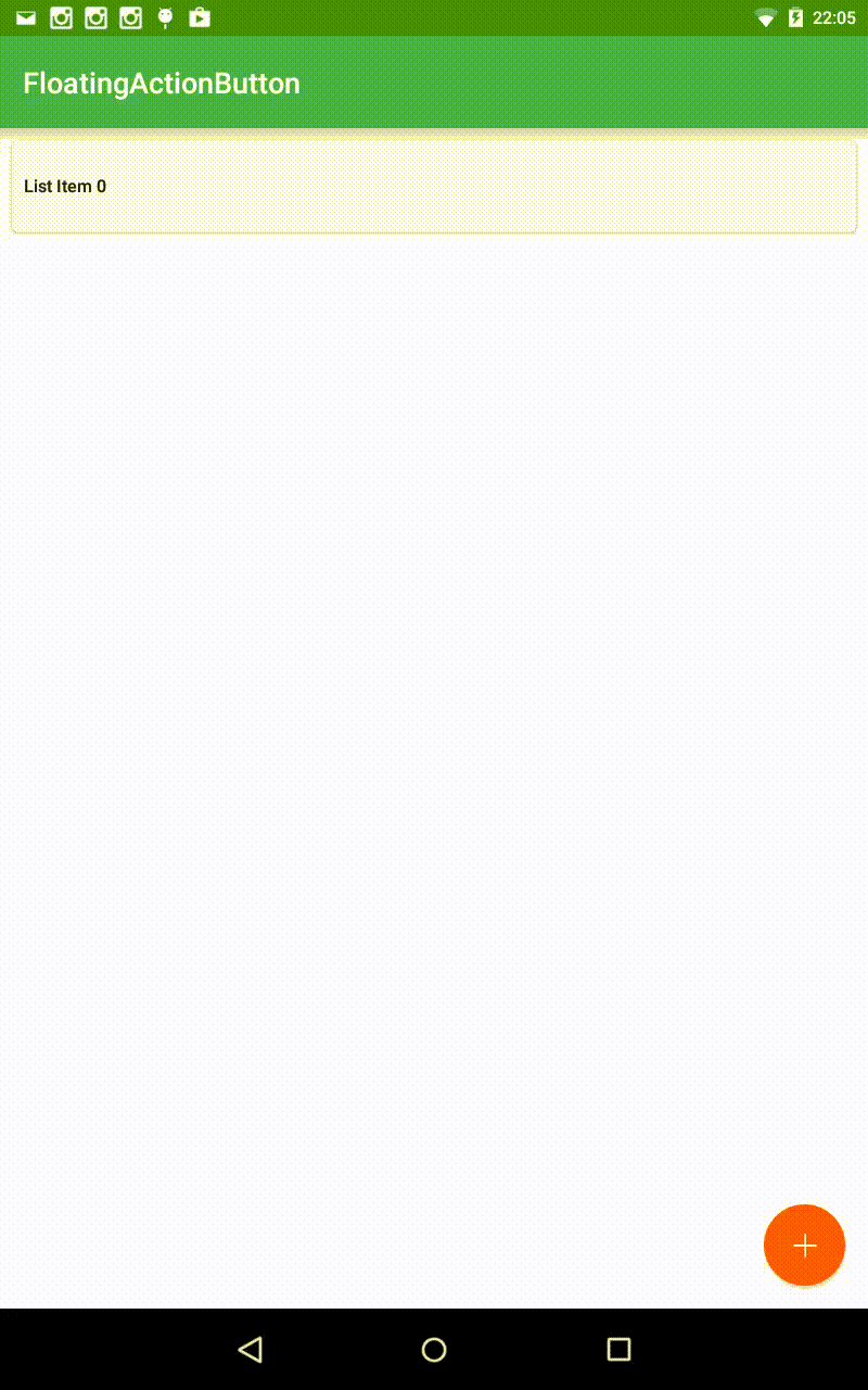
We have, at this point, successfully implemented a Floating Action Button in an Activity, that works across Android devices from version 4 to version 21. FABs can be a very important part of an Activity, especially if there is a single action that would most likely be performed by users. FABs can be designed to hide and show itself in response to user scrolling through content, or performing other actions. Implementing and maintaining a custom FAB codebase can be a lot of work. There are third party libraries that implement FABs using the material specifications, and provide additional functionality. Some popular FABs on Github include this, this and this.
The complete source code used in this tutorial is available on github.
Support Xmodulo
This website is made possible by minimal ads and your gracious donation via PayPal or credit card
Please note that this article is published by Xmodulo.com under a Creative Commons Attribution-ShareAlike 3.0 Unported License. If you would like to use the whole or any part of this article, you need to cite this web page at Xmodulo.com as the original source.

Xmodulo © 2021 ‒ About ‒ Write for Us ‒ Feed ‒ Powered by DigitalOcean