How to use RecyclerView and CardView on Android Lollipop
Last updated on March 19, 2015 by Obaro Ogbo
Android Lollipop introduced a whole new design paradigm, called Material Design. It encourages the use of bolder colors, flatter UI elements, and smoother animations. Android Lollipop introduces corresponding new APIs to help developers implement the Material Design guidelines, and two of these UI widgets are RecyclerView and CardView. The RecyclerView is designed to replace the ListView, while the CardView is a new type of layout.
This article shows how powerful and easy to use these two widgets can be together.
Setup
Both RecyclerView and CardView are new API's, added in SDK 21. Thankfully, they have been made available through the support libraries. This means that both widgets are available for devices running API Level 7 (Gingerbread) and above.
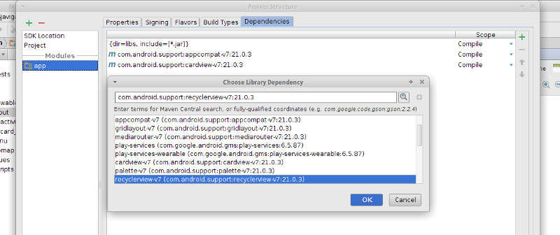
For both RecyclerView and CardView to be available in an Android project, they have to be added to the dependency list. In AndroidStudio, they can both be added by:
- Right click on the project name
- Select "Open Module Settings"
- Select "Dependencies"
- Add both cardview and recyclerview

RecycleView
RecyclerView was designed to replace the ListView, and it does this very well. ListView can be implemented in a variety of ways, although Google encouraged developers to use the ViewHolder design pattern to achieve smoother scrolling (remember project butter?). The ViewHolder pattern achieves this smoother scrolling by keeping list items in memory, so that they can be accessed as needed, rather being repeatedly looked up. RecyclerView forces the use of the ViewHolder pattern, which is a good thing.
The RecyclerView is used just like the ListView. You add the RecyclerView to the Layout Manager exactly where a ListView should be in our Activity layout file (activity_main.xml),
<RelativeLayout xmlns:android="http://schemas.android.com/apk/res/android"
    xmlns:tools="http://schemas.android.com/tools" android:layout_width="match_parent"
    android:layout_height="match_parent"
    android:paddingLeft="16dp"
    android:paddingRight="16dp"
    android:paddingTop="16dp"
    android:paddingBottom="16dp"
    tools:context=".MainActivity">

    <android.support.v7.widget.RecyclerView
        android:id="@+id/recyclerList"
        android:layout_width="match_parent"
        android:layout_height="match_parent" />

</RelativeLayout>
That's it. We now have a RecyclerView in our code. We will explore how to make use of it later in the tutorial. For now, that's all that's needed.
CardView
The CardView widget displays information inside cards. Each card will represent a row in the RecyclerView. Internally, CardView is a subclass of FrameLayout, so it is not a stretch to treat your CardView as you would a FrameLayout. We create a layout file called card_view.xml
<?xml version="1.0" encoding="utf-8"?>
<android.support.v7.widget.CardView
    xmlns:card_view="http://schemas.android.com/apk/res-auto"
    xmlns:android="http://schemas.android.com/apk/res/android"
    android:id="@+id/card"
    android:layout_width="match_parent"
    android:layout_height="150dp"
    card_view:cardCornerRadius="4dp"
    android:layout_margin="5dp">

    <RelativeLayout
        android:id="@+id/cardBackground"
        android:layout_width="match_parent"
        android:layout_height="match_parent">

        <TextView
            android:id="@+id/name"
            android:layout_width="match_parent"
            android:layout_height="wrap_content"
            android:text="Title"
            android:gravity="center_vertical"
            android:textColor="@android:color/white"
            android:textSize="30dp"/>

        <TextView
            android:id="@+id/hexValue"
            android:layout_width="wrap_content"
            android:layout_height="wrap_content"
            android:text="Content"
            android:gravity="center_vertical"
            android:textColor="@android:color/white"
            android:textSize="25dp"
            android:layout_below="@+id/name"
            android:layout_marginTop="10dp"
            android:layout_marginLeft="5dp"/>

    </RelativeLayout>

</android.support.v7.widget.CardView>
In the code above, note 'xmlns:card_view="http://schemas.android.com/apk/res-auto"' and 'card_view:cardCornerRadius="4dp"'. While CardView is a FrameLayout, it has its own extensions that provide easy and powerful customisations.
Putting Them Together
So far so good. We have designed both our RecyclerView and CardView. How do we make our RecyclerView display cards for each list item? We need three things:
1. An Object for each list item
We want to display a list of colors (Palettes), so we define a Palette object. Each palette has a name, a hexadecimal value, and an int value.
public class Palette {
    private String name;
    private String hexValue;
    private int intValue;

    public Palette(String name, String hexValue, int intValue) {
        this.name = name;
        this.hexValue = hexValue;
        this.intValue = intValue;
    }

    public String getName() {
        return name;
    }

    public String getHexValue() {
        return hexValue;
    }

    public int getIntValue() {
        return intValue;
    }
}
2. A ViewHolder, that holds a card (and the card's data)
We define a ViewHolder. The ViewHolder's constructor receives a View object, which in our case would be our defined CardView (card_view.xml)
public class PaletteViewHolder extends RecyclerView.ViewHolder {

    protected TextView titleText;
    protected TextView contentText;
    protected CardView card;

    public PaletteViewHolder(View itemView) {
        super(itemView);
        titleText = (TextView) itemView.findViewById(R.id.title);
        contentText = (TextView) itemView.findViewById(R.id.content);
        card = (CardView) itemView;
    }
}
3. An Adapter, that maps list item objects to ViewHolder objects
The Adapter must be a class that extends RecyclerView.Adapter<T> (where T is your ViewHolder class).
Your Adapter should have three new methods as follows.
onCreateViewHolder, where you specify the CardView to be used.
    @Override
    public PaletteViewHolder onCreateViewHolder(ViewGroup viewGroup, int i) {
        View itemView = LayoutInflater.
                from(viewGroup.getContext()).
                inflate(R.layout.card_view, viewGroup, false);

        return new PaletteViewHolder(itemView);
    }
onBindViewHolder, where you map each Object's data to the corresponding widget in the CardView.
    @Override
    public void onBindViewHolder(PaletteViewHolder paletteViewHolder, int i) {
        Palette palette = palettes.get(i);
        paletteViewHolder.titleText.setText(palette.getName());
        paletteViewHolder.contentText.setText(palette.getHexValue());
        paletteViewHolder.card.setCardBackgroundColor(palette.getIntValue());
    }
getItemCount, which returns the number of items in your list.
The code for our example is:
public class MyRecyclerAdapter extends RecyclerView.Adapter<PaletteViewHolder> {

    private List<Palette> palettes;

    public MyRecyclerAdapter(List<Palette> palettes) {
        this.palettes = new ArrayList<Palette>();
        this.palettes.addAll(palettes);
    }

    @Override
    public PaletteViewHolder onCreateViewHolder(ViewGroup viewGroup, int i) {
        View itemView = LayoutInflater.
                from(viewGroup.getContext()).
                inflate(R.layout.card_view, viewGroup, false);

        return new PaletteViewHolder(itemView);
    }

    @Override
    public void onBindViewHolder(PaletteViewHolder paletteViewHolder, int i) {
        Palette palette = palettes.get(i);
        paletteViewHolder.titleText.setText(palette.getName());
        paletteViewHolder.contentText.setText(palette.getHexValue());
        paletteViewHolder.card.setCardBackgroundColor(palette.getIntValue());
    }

    @Override
    public int getItemCount() {
        return palettes.size();
    }
}
Running the Program
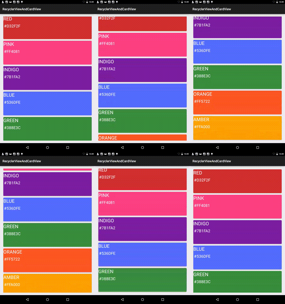
At this point, we have completed the integration of both RecyclerView and CardView except for one small step. Our RecyclerView must be connected to its Adapter. This is done from the Activity that should display the list. In the onCreate method, we inflate the RecyclerView.
The RecyclerView requires a LayoutManager (NOTE: requires). The APIs currently provide a default LayoutManager (LinearLayoutManager), which determines how the contents of the list are positioned on the list. We inflate the RecyclerView, set the LayoutManager, and call setAdapter to set its adapter to an instance of our adapter.
public class MainActivity extends ActionBarActivity {

    @Override
    protected void onCreate(Bundle savedInstanceState) {
        super.onCreate(savedInstanceState);
        setContentView(R.layout.activity_main);

        RecyclerView recyclerView = (RecyclerView) findViewById(R.id.recyclerList);
        LinearLayoutManager llm = new LinearLayoutManager(this);
        llm.setOrientation(LinearLayoutManager.VERTICAL);
        recyclerView.setLayoutManager(llm);

        recyclerView.setAdapter(new MyRecyclerAdapter(generatePalettes()));
    }

    private ArrayList<Palette> generatePalettes() {
        ArrayList<Palette> palettes = new ArrayList<>();
        palettes.add(new Palette("RED", "#D32F2F", Color.parseColor("#d32f2f")));
        palettes.add(new Palette("PINK", "#FF4081", Color.parseColor("#ff4081")));
        palettes.add(new Palette("INDIGO", "#7B1FA2", Color.parseColor("#7b1fa2")));
        palettes.add(new Palette("BLUE", "#536DFE", Color.parseColor("#536dfe")));
        palettes.add(new Palette("GREEN", "#388E3C", Color.parseColor("#388e3c")));
        palettes.add(new Palette("ORANGE", "#FF5722", Color.parseColor("#ff5722")));
        palettes.add(new Palette("AMBER", "#FFA000", Color.parseColor("#ffa000")));
        return palettes;
    }
}
The sample code used in this tutorial is available at Github.
Conclusion

RecyclerView is the correct (and efficient) way to create lists in your Android app. Using a CardView with a RecyclerView enables developers to build high quality apps that display lists of items quickly and easily.
I am very interested in learning of a corner case where a ListView would be a better fit than a RecyclerView.
Support Xmodulo
This website is made possible by minimal ads and your gracious donation via PayPal or credit card
Please note that this article is published by Xmodulo.com under a Creative Commons Attribution-ShareAlike 3.0 Unported License. If you would like to use the whole or any part of this article, you need to cite this web page at Xmodulo.com as the original source.
Xmodulo © 2021 ‒ About ‒ Write for Us ‒ Feed ‒ Powered by DigitalOcean

